.png)
Most email support dashboards are reporting tools — they tell you what happened last week. Volume went up 12%. Average response time was 4.7 hours. CSAT was 84%. These numbers describe the past but provide no clear path to improvement. You know your response time was 4.7 hours, but you do not know why, which categories drove it up, or what to do differently this week.
A modern email analytics dashboard — powered by AI — does more. It diagnoses problems, identifies optimization opportunities, predicts future performance, and tells you exactly what to do this week to improve. This guide covers the four dashboard layers every email support operation needs in 2026.
Layer 1: Operational Overview (The Basics)
Every email dashboard starts with the fundamentals: total email volume (daily, weekly, monthly, with trend lines), first response time (median and 90th percentile, by priority tier), resolution time (median, by category), CSAT score (overall and by category), backlog (current size, age distribution, trend), and SLA compliance rate (percentage of emails resolved within target).
These are table-stakes metrics. They should be real-time (not end-of-day), available to the entire support team (not just managers), and segmented by email category (WISMO, billing, returns, technical). If your dashboard only has Layer 1, you are describing your operation — not optimizing it.
Layer 2: AI Performance Metrics (The New Essentials)
When AI handles a significant share of email volume, you need metrics that capture how well the AI is performing and where to improve it.
Bot Resolution Rate (BRR) by Category
Overall BRR (e.g., 72%) is useful as a headline number. Category-level BRR is where the actionable insight lives. If WISMO is at 92% BRR but billing is at 45%, you know exactly where to invest: improve billing-related knowledge base content and add billing system integrations. Display BRR as a category-by-category breakdown with targets and trend arrows.
Confidence Score Distribution
Plot the distribution of AI confidence scores across all processed emails. A healthy distribution shows a large cluster at 85–100% (auto-resolved), a smaller cluster at 60–84% (draft mode, one-click approval), and a small tail below 60% (escalated to humans). If the 60–84% cluster is growing, it means the AI is encountering more uncertain situations — usually a sign that new email types are arriving or the knowledge base is falling behind.
Knowledge Gap Report
List the top 10 email topics where the AI could not find relevant knowledge base content, ranked by frequency. This is the single most actionable report on your dashboard — each entry represents a category of emails you could automate if you wrote the content. Closing one knowledge gap per day is the fastest path to improving BRR.
AI vs Human Performance Comparison
Side-by-side comparison of AI-resolved and human-resolved emails across CSAT, first contact resolution, average handle time, accuracy (from QA scoring), and cost per ticket. This comparison answers the critical question: "Is the AI delivering the same quality as humans?" In most mature deployments, AI matches or exceeds human performance on CSAT and FCR while dramatically winning on speed and cost.
Layer 3: Predictive and Diagnostic Insights
Volume Forecasting
AI can predict email volume for the coming week based on historical patterns, seasonal trends, and known events (product launches, marketing campaigns, billing cycles). Accurate volume forecasting lets you proactively adjust agent scheduling and AI thresholds — avoiding the Monday morning scramble of discovering the queue is twice as long as expected.
SLA Breach Prediction
Based on current queue depth, agent capacity, and incoming velocity, predict whether any SLA breaches will occur in the next 2–4 hours. Display this as a traffic-light indicator: green (on track), yellow (at risk — action needed), red (breaches imminent). This turns SLA management from reactive (discovering breaches after they happen) to proactive (preventing them before they occur).
Root Cause Analysis
When a metric degrades — FRT spikes, CSAT drops, backlog grows — the dashboard should surface the likely cause. FRT spike? Show which email categories drove the increase and whether it correlates with a volume spike, agent shortage, or AI confidence drop. CSAT drop? Show which email categories have the lowest satisfaction scores and whether AI or human responses are driving the decline. This diagnostic capability turns "something went wrong" into "this specific thing went wrong for this reason."
Layer 4: Strategic Insights for Leadership
Cost Per Ticket Trend
Display blended cost per email ticket over time, with a breakdown showing AI cost per ticket and human cost per ticket separately. For leadership, the story is: "Our blended cost per ticket has dropped from $8.50 to $3.20 over 6 months while volume increased 25% — because AI now resolves 72% of emails at $1.50 each." This is the metric that justifies the AI investment and secures continued budget.
Automation Expansion Roadmap
Show which email categories are currently automated, which are in draft mode, and which are fully manual — with the estimated impact of automating the next category. For example: "Billing queries are currently in draft mode (45% BRR). Adding the payment gateway integration and 5 KB articles would enable full automation, increasing BRR to an estimated 65% and reducing blended cost per ticket by $0.40." This transforms the dashboard from a reporting tool into a strategic planning tool.
Channel Comparison
Compare email performance against chat, voice, and other channels on cost per interaction, CSAT, resolution rate, and AI auto-resolution rate. This data supports the email-first automation thesis: when leadership sees that email AI achieves 72% auto-resolution versus 45% for chat, at $1.50 per resolution versus $0.80 for chat but with 2x the volume, the ROI case for continued email AI investment is self-evident.
Building the Dashboard: Practical Guidance
Data sources: your AI email platform (BRR, confidence scores, knowledge gaps), your helpdesk (ticket data, SLA tracking, CSAT), and your HR/finance system (agent costs for cost-per-ticket calculations). Most AI platforms like Robylon provide built-in dashboards covering Layers 1 and 2. For Layers 3 and 4, you may need to export data to a BI tool (Looker, Tableau, Metabase) or use the platform's API.
Refresh frequency: Layers 1 and 2 should be real-time or near-real-time (refreshed every 5–15 minutes). Layer 3 can refresh hourly. Layer 4 is typically a weekly or monthly view.
Audience: Layer 1 is for the entire team (displayed on a team dashboard screen). Layer 2 is for the AI Operations Manager and QA Analyst. Layer 3 is for the team lead and manager. Layer 4 is for leadership (VP of Support, CFO).
Bottom Line
The difference between a basic dashboard and an effective one is the difference between knowing what happened and knowing what to do about it. AI-powered email analytics adds the layers that turn reporting into optimization: confidence distributions that reveal where to adjust thresholds, knowledge gap reports that tell you exactly what content to write, predictive alerts that prevent problems before they occur, and cost trends that prove ROI to leadership.
See your email operation clearly. Robylon AI includes built-in analytics across BRR, confidence distribution, knowledge gaps, AI vs human comparison, and cost per ticket — with real-time dashboards for your team and leadership. Start free at robylon.ai
FAQs
How often should email analytics dashboards refresh?
Layer 1 (operational) and Layer 2 (AI performance): real-time or every 5–15 minutes — the team needs live visibility into queue depth, BRR, and SLA status. Layer 3 (predictive): hourly refresh — breach predictions and volume forecasts need current data but not second-by-second updates. Layer 4 (strategic): weekly or monthly — leadership reviews trends, not live data. Match the refresh frequency to the audience and the decision speed required.
What metrics should I show leadership for email support?
Four leadership metrics: 1) Cost per email ticket (blended AI + human, trending down — proves ROI). 2) Bot Resolution Rate (percentage automated, trending up — shows AI adoption progress). 3) Customer Satisfaction (CSAT stable or improving — proves quality is maintained). 4) Email backlog trend (shrinking or stable — proves operational control). Present as a monthly trend with before/after AI deployment comparison. The strongest visualization: cost per ticket declining while volume increases.
How should I compare AI vs human email support performance?
Side-by-side on 5 metrics: CSAT (AI typically 85–92%, matching or exceeding human), First Contact Resolution (AI: 80–90% vs human: 55–65%), Average Handle Time (AI: seconds vs human: 7–12 minutes), Cost per ticket (AI: $0.50–$2 vs human: $5–$15), and Accuracy (spot-check 50 weekly). This comparison reveals where AI excels (speed, consistency, cost) and where humans add unique value (complex judgment, emotional sensitivity) — guiding optimization and staffing decisions.
What is the most actionable report on an email analytics dashboard?
The knowledge gap report — a ranked list of email topics where the AI could not find relevant KB content, sorted by frequency. Each entry represents a category of emails you could automate if you wrote the content. Closing one knowledge gap per day is the fastest path to improving BRR. Example: "Loyalty program redemption (47 emails this week, 0% auto-resolved)" tells you exactly what article to write to immediately automate those 47 emails next week.
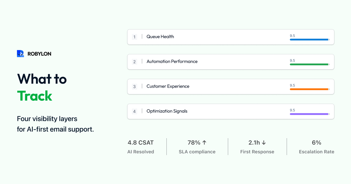
What are the four layers of a modern email support dashboard?
Layer 1: Operational overview — volume, FRT, resolution time, CSAT, backlog, SLA compliance (table-stakes, real-time). Layer 2: AI performance — BRR by category, confidence distribution, knowledge gap report, AI vs human comparison (the new essentials). Layer 3: Predictive diagnostics — volume forecasting, SLA breach prediction, root cause analysis (turns reporting into prevention). Layer 4: Strategic insights — cost per ticket trend, automation expansion roadmap, channel comparison (for leadership and CFO reporting).
.png)


.webp)